Top Five! Top Five! TOP FIVE EVERYONE!
The U.S. Open Cup Final has been determined and the two teams remaining are Sporting KC and New York Red Bulls of the MLS. So let's start with Major League Soccer and see who's got the best logo.
Take a look below at how I rank the top 5 logos in the MLS and let me know your thoughts!
TOP 5 MLS LOGOS
1. ?
2. ?
3. LA Galaxy
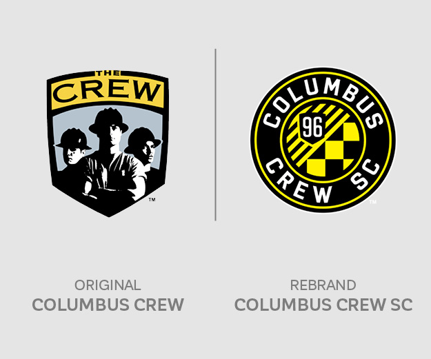
4. ?
5. Atlanta United FC
Coming in at number five is the team I did my first logo breakdown about; Atlanta United FC.
Check out my in-depth analysis here.
Atlanta is the only circular logo to make the list. As I mentioned before, I'm not against circular logos, they just need to be extra creative. I like the bold and two-tone A smack dab in the middle, but what I particularly like about the A is the anchoring of it to the inner-circle. There is only one thing I don't particularly like about this logo, and it is the reason why I didn't make it any higher on my ranking; the two lines in the black circle just seem a bit lost to me. Other than that, I think it's a strong solid logo.


Another expansion team that recently joined the MLS, Minnesota United FC, comes in at fourth on the list, much different than their current standing the MLS Western Conference.
Three main reasons this logo stood out to me.
1. The asymmetrical shield, which compared to all the rest of the logos in the league, its a bit unorthodox; but that is why it stood out to me. It's different and refreshing.
2. Negative space-I love the wing of the loon(MN's state bird) breaking through the shield and the North Star fits perfectly across from it.
3. Finally, color scheme, the only other team to use a light blue in their crest is the Colorado Rapids. However, I would have liked to seen a little bit more of a separation in tones. The blue is nice and subtle, I think the grey just needs to be slightly darker.
The determining factor in LA Galaxy's logo was the color scheme. Personally I am a big fan of yellow/gold and blue combination, but if I'm being honest, I'm a fan of any light/dark color combination. The use of two-tone gold and two-tone blue, makes this logo really stand out. Many of us would have gone with black rather than blue to portray the night sky, but the dark blue does a good job, and with LAFC coming in 2018, it was a good choice. I'm OK with the font, it doesn't scream space/galaxy to me, but what the font lacks, the star makes up for. Not only does the star fill in the negative space above LA, but it gives us the sense of a night sky full of stars.


Here is an example of a great re-brand. Unveiled back in December of 2015, D.C. United updated their logo.
A perfect upgrade from their old logo. As you can see, they got rid of the generic soccer ball. The new modern eagle is a very clean and smooth. Just like the loon in Minnesota's logo, the eagles wings break from the shield. The only thing I wish they would have done, is kept the gold in the star from the old logo and incorporate that into the color scheme.
Even though I cannot stand Clint Dempsey, I didn't let it affect my love for the Seattle Sounders FC Logo. Seattle's badge and colors fact sheet tells us everything behind the logo here.
It is exactly what I have been preaching; a logo that is different, fresh and defines its city. Like Minnesota, Seattle's shield is one of a kind, though the difference here is it's symmetry. There is a clean use of negative space in between inside shield colors and outline border. By doing so, it causes the colors, which are officially called Sounder Blue and Rave Green to really stand out. Not only does this color scheme work really well together, but it clearly represents the bodies of water and forests that define a big part of Seattle. Finally the clean illustration of the Space Needle ties in the most universally recognized wonder in Seattle.

Want to know how I rate these logos? Here's a little breakdown:
- Originality- What makes the logo its own? Does it stand out among the rest, or blend in?
- Creativity- Is there that special thing that makes it stand out? What sets it apart from the others in a special way?
- Color Scheme- I'm looking for 1-3 colors, maybe four, at the very most five, if they're used well.
Agree? Don't agree? Leave a reply!