I'm back and excited to begin this awesome project! Last week I reviewed my Top Five logos in the MLS, check it out here; this time though I will be choosing my bottom five. However, rather than just rate them, I'm going to take a stab at recreating each logo. Be sure to check back on Wednesday when I start with the fifth of the bottom five logos in the MLS. It won't be easy, but who doesn't like a challenge?
Let's get started, take a look below at how I rank the bottom 5 logos in the MLS.
Bottom 5 MLS LOGOS
1. ?
2. ?
3. New York Red Bulls
4. ?
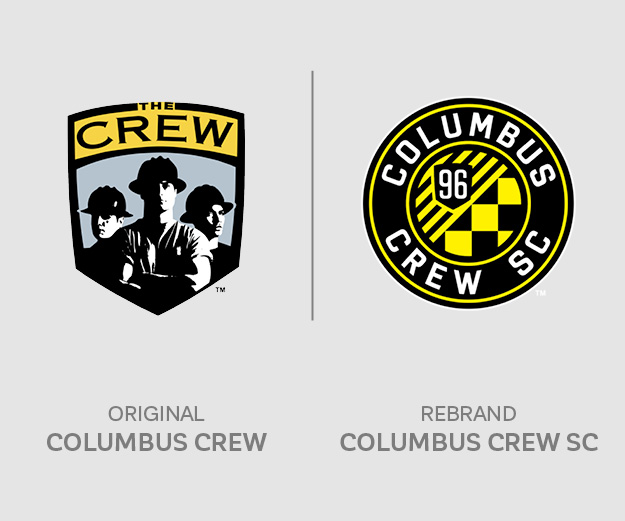
5. Real Salt Lake
Well let's jump right into this thing, here is the first team I think needs to start working on a re-brand, Real Salt Lake. I'm pretty sure many of you will disagree but hear me out. This logo has a lot of potential for improvements, for instance the color scheme. The red and blue is a bit hard to read together, I would go with a different shade of blue. I like the yellow, but the outside border is tough to differentiate on a white background. Soccer ball has an interesting design to it, I think if that were featured a bit more predominantly, it could work.
I'm going to enjoy putting my little spin on this one. Make sure you check back later this week for it!


The San Jose Earthquakes is also a team that I feel has great potential; I feel that their current logo could use make some adjustments. The blue looks really nice with the black and white. However, the 1974 is very tough to read and doesn't stand out against the direct b/w contrast next to it. The soccer ball is a bit generic looking, the lines are a bit angled to give a different look but I would maybe remove it.
The blue stripes are representative of the earth's tectonic plates and presenting them shifted like that gives the sense of an earthquake. I know it's a bit of a stretch but it's hard to visually represent an earthquake.
It really annoys me that the team name is New York Red Bulls, and feature two bulls, but the logo just says Bull. I'm not sure who and why they made that decision, but it'd be nice to understand. I like how the bulls break out of the shield, though the little hooves floating in the air is a bit odd.
Seems like every team in the league has blue in it's color scheme. A lot of them all being a similar shade as well. Again, annoying, I wish they would have kept the MetroStars color scheme. The color I do like is the random circle of yellow.
This one I sense might be a little tough to do! Can't wait!


As previously reported by Nick Schwartz while at Fox Sports(source), this looks VERY similar to the Texas Longhorns logo.
Here we see the same color scheme again that is featured throughout the league, red, white and blue.
I get the star, lonestar state, but I'm not sure what the flame on the forehead means.
To be honest, this one might be the toughest one.
I don't even know where to start with this one. This seems like someone read my blog and went crazy with it. It is unquestionably original, but this does not work for a soccer logo. I mean what was the New England Revolution thinking?
Soccer is still on the rise in the U.S., some people don't know the MLS, new expansion teams keep coming in.
Now by looking at this logo and not knowing anything about the teams in the MLS, can you tell me the team name?...

Want to know how I rate these logos? Here's a little breakdown:
- Originality- What makes the logo its own? Does it stand out among the rest, or blend in?
- Creativity- Is there that special thing that makes it stand out? What sets it apart from the others in a special way?
- Color Scheme- I'm looking for 1-3 colors, maybe four, at the very most five, if they're used well.
Agree? Don't agree? Leave a reply!